User Info Block
The User Info block lets you display information about the currently logged-in user anywhere on your site. It can show their name, avatar, and join date, with customizable layout and styling.
This block is perfect for creating personalized experiences such as: adding a welcome message to a site page, showing details on a dashboard page, or displaying membership information inside a members-only area.

Insert a User Info Block
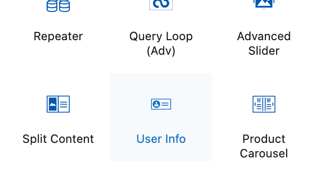
Add a new block to your page and select the User Info block from the Kadence Blocks section.
User Info Block Settings
General Settings
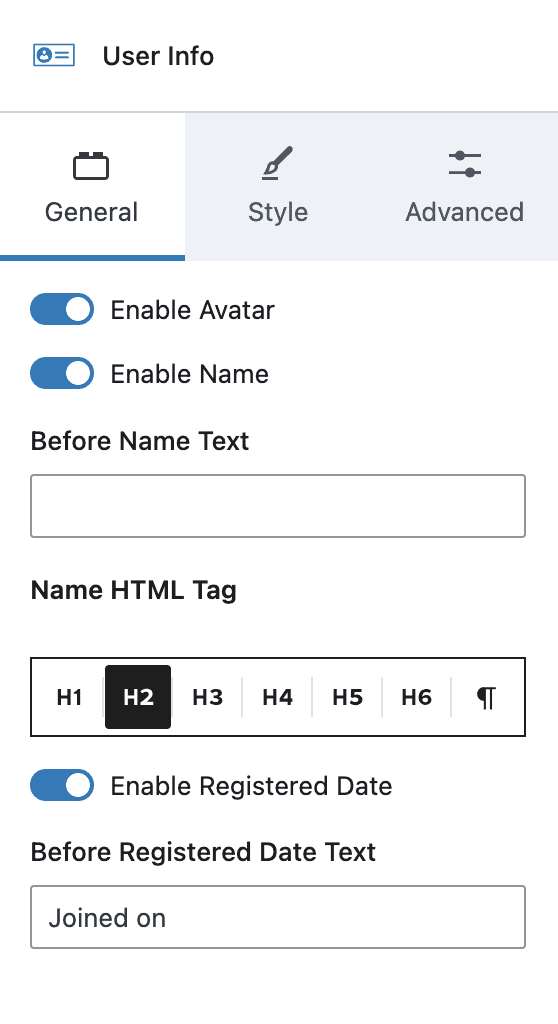
Enable Avatar – Enable to show the WordPress avatar for the user.
Enable Name – Enable to show the user’s display name.
Before Name Text – Optional text to display before the user’s name.
Name HTML Tag – Choose the tag used to display the user’s name.
Enable Registered Date – Enable to display the date on which the user was registered on this site.
Before Registered Date Text – Optional text to display before the user registration date.
Style Settings
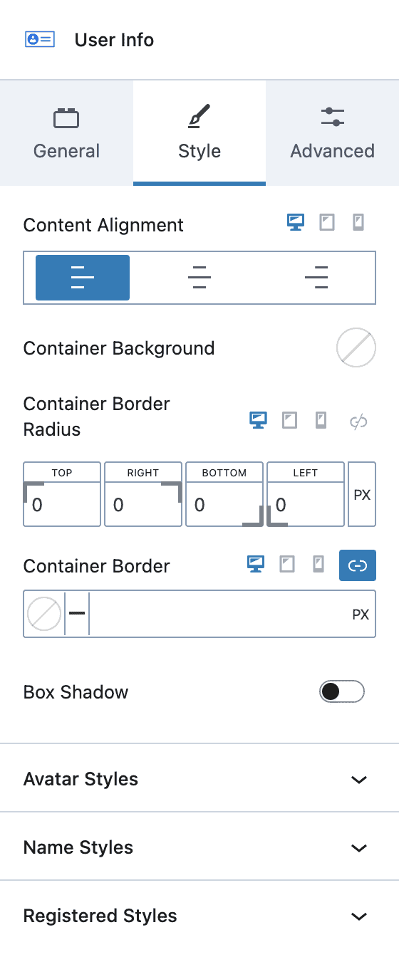
Content Alignment – Choose left, center or right. Select a screen-size for responsive settings.
Container Background – Choose a color for the block background.
Container Border – Choose a border-radius, border-color, style and thickness.
Box Shadow – Enable the box shadow feature and select a style.
Avatar Styles – Choose an avatar image width, border-radius and styling, padding, and gap with content.
Name Styles – Choose name font-color, font-size, line-height, letter-case, font-family, font-weight, letter-spacing, padding and margin.
Register Styles – Choose register date font-color, font-size, line-height, letter-case, font-family, font-weight, letter-spacing, padding and margin.