Setting custom widths in multi-column Row Layout Blocks
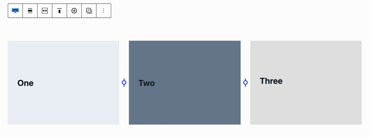
The Kadence Row Layout Block supports the use of up to 6 Columns in a Single Row. Each column can be adjusted, giving you the power to make stunning multi-column layouts of different widths.
You can only adjust the width of Row Layout Blocks that use a single-row layout. If it is a multi-row layout, the column adjustment option won’t be available.
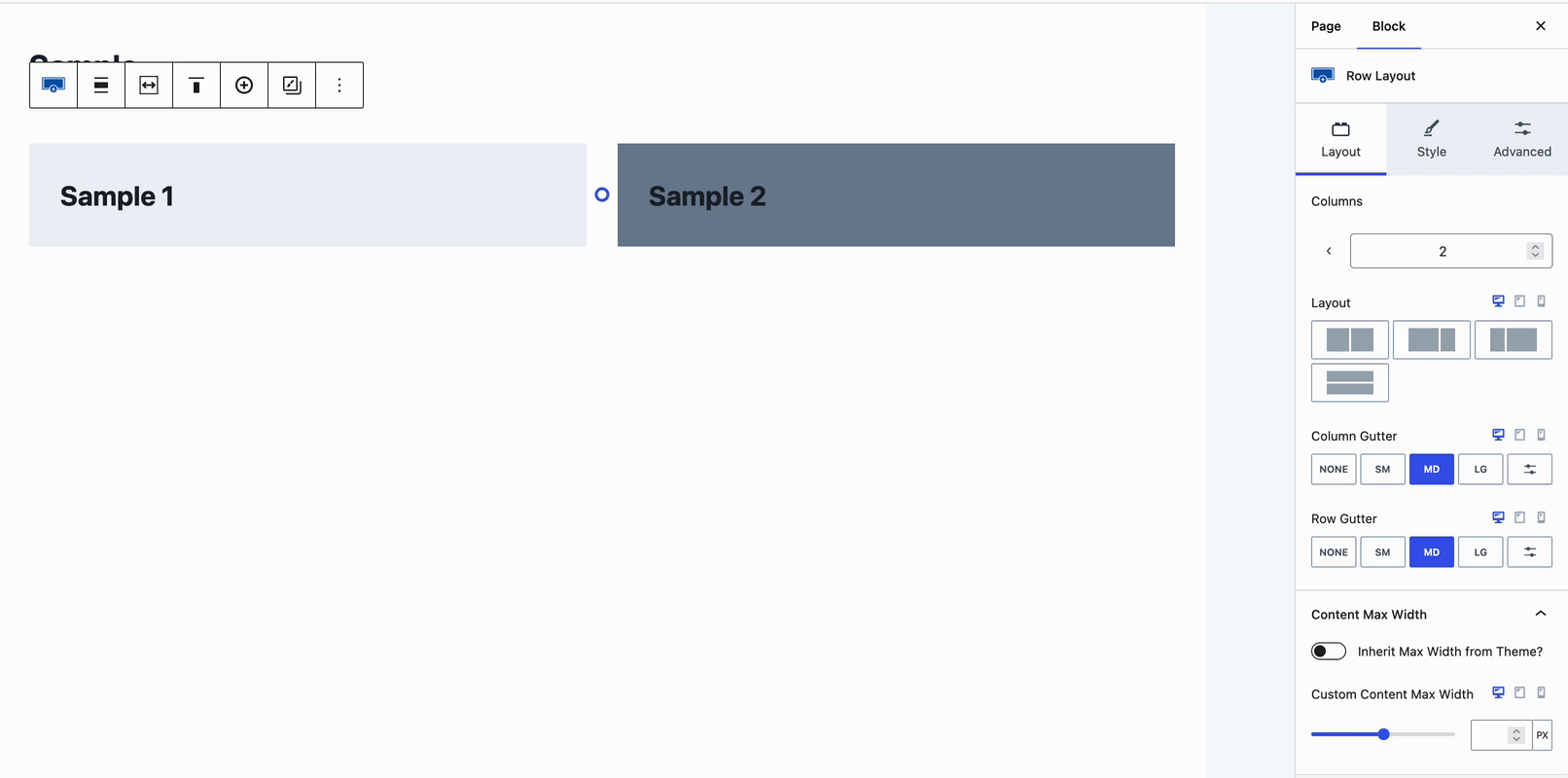
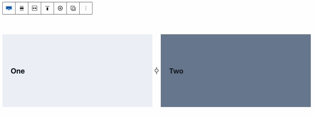
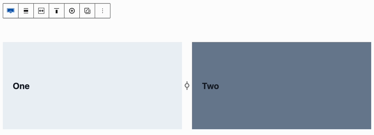
This is a Single-Row Layout. These types of Layouts do support the Custom Width Adjuster.
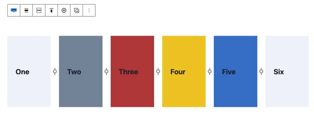
This is a Multi-Row Layout. These types of Layouts do not support the Custom Width Adjuster.
Examples
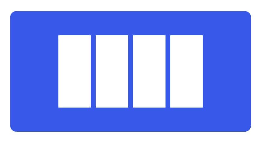
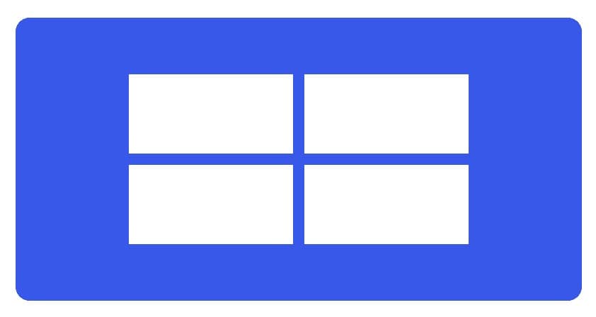
You can adjust the number of columns and widths of each column to meet your design needs. Reference the examples below for layouts that the Row Layout Block can achieve.
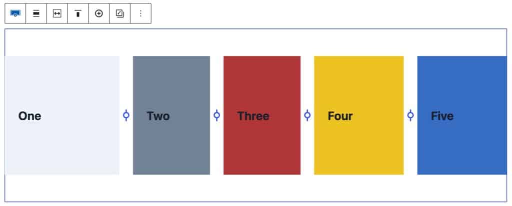
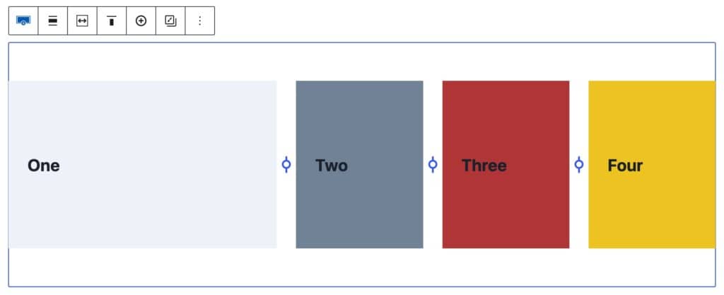
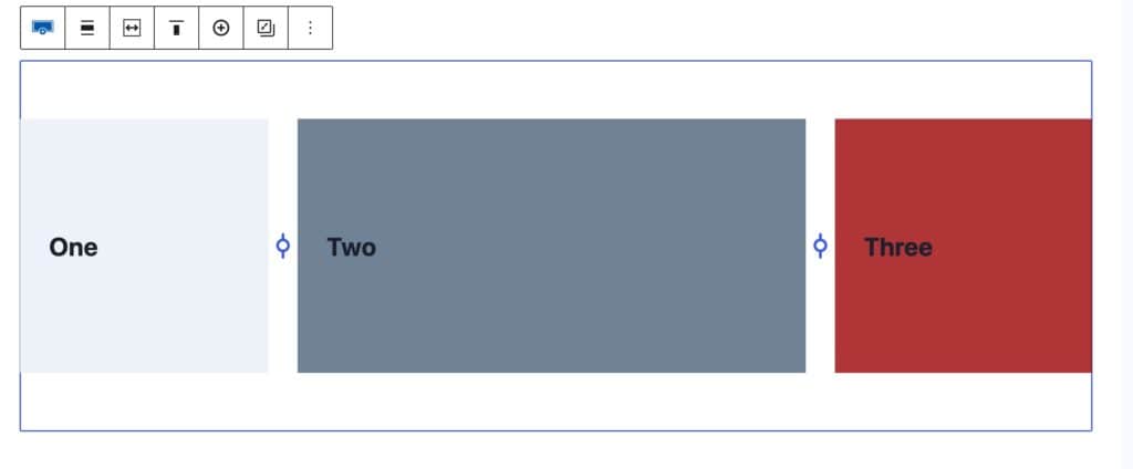
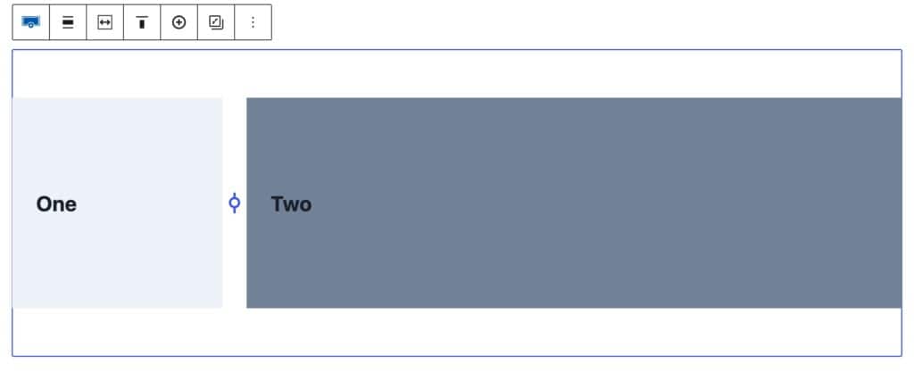
Adjusting Multi-Column Layouts
To adjust a Row Layout Block with multiple columns, add a Row Layout Block to the page and select a multi-column layout.
Select the Row Layout Block. With the Row Layout Block selected, notice the adjuster icon(s) between the sections within the Row Layout Block.
Hovering over this icon will show you the percentage of the section split
Once you click the adjuster icon, it can be dragged to the left or right to adjust the column widths.
On each side of the adjuster, the percentage of each column can be viewed for adjustment. The left side of the adjuster will display the percentage of the column to the left of the adjuster and the right side of the adjuster will display the percentage of the column to the right of the adjuster accordingly.
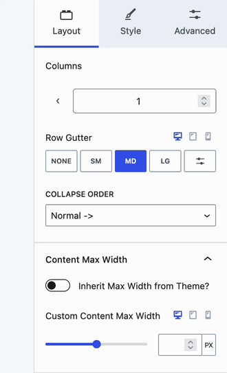
Layout Block Setting
The Layout Block Setting can be used to select a standard layout for your Row Layout Block. The number of columns you decide to use will determine the available layout options.
Adjusting Tablet and Mobile Widths Separately
Whenever an adjustment is made for a desktop, there are cases where it would be ideal to use different column widths depending on the device type. The Kadence Row Layout Block allows you to use different column widths for desktop, tablet, and mobile screen sizes.
When selecting the Row Layout Block, look for the Layout Block Setting. Click on the tablet or mobile icon next to the Layout Block Setting to adjust the setting for that screen size.