

Spacer/Divider Block
The spacer block allows you to set advanced spacing between your other blocks. The spacing block can be configured quick and easy on any part of your site!
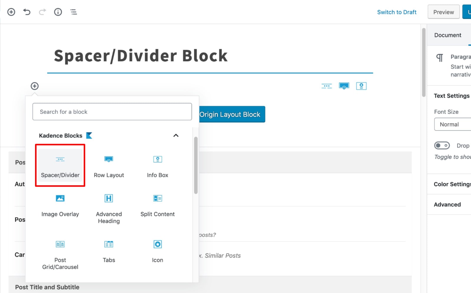
Once you’ve selected the spacer block, adjust the spacing to your desired amount:
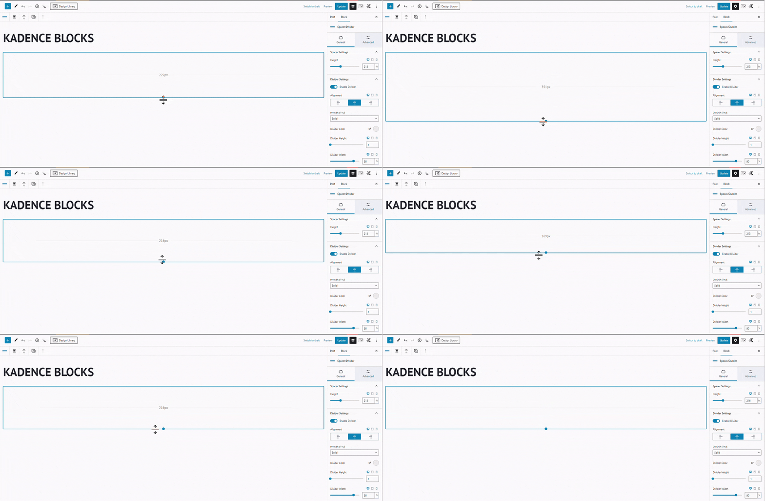
Set the appearance of your spacer block:
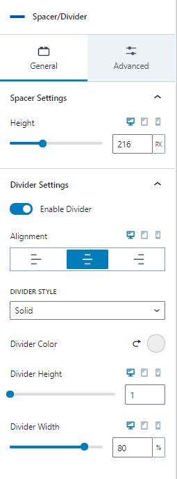
There are four (4) unique divider styles available.
Solid: You can adjust the solid divider’s color, height, and width.
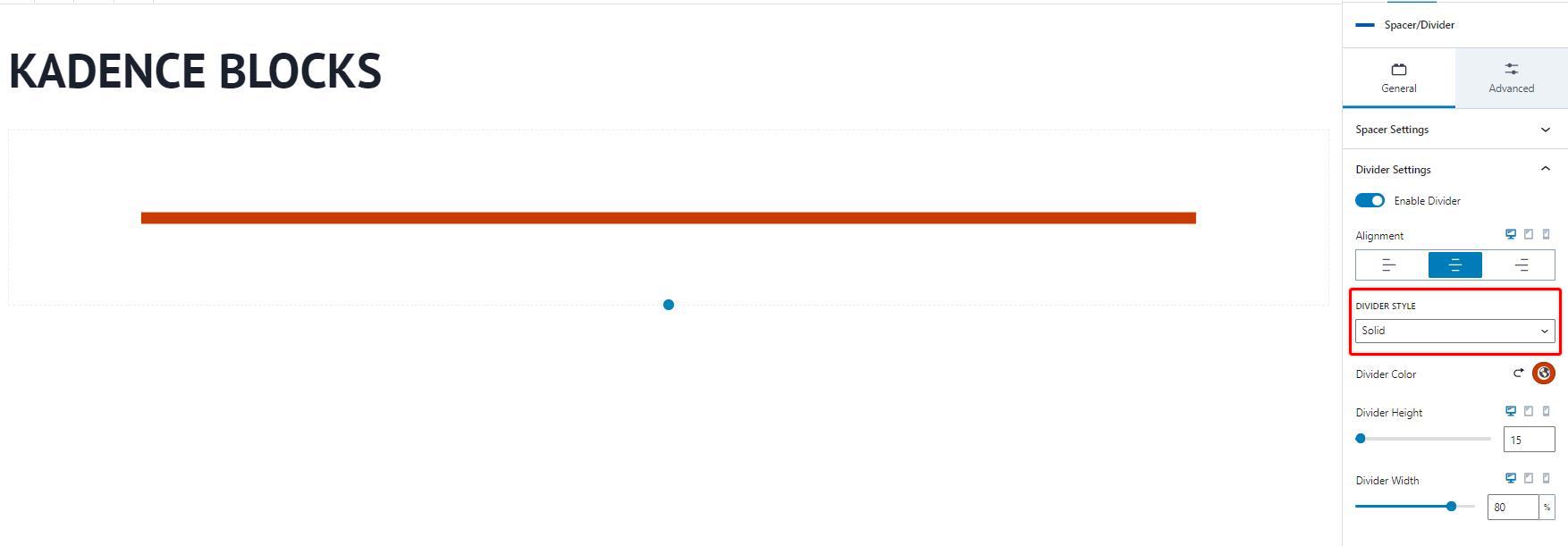
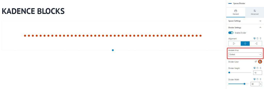
Dotted: You can adjust the dotted divider’s color, height, and width.
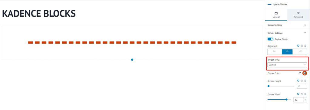
Dashed: You can adjust the dashed divider’s color, height, and width.
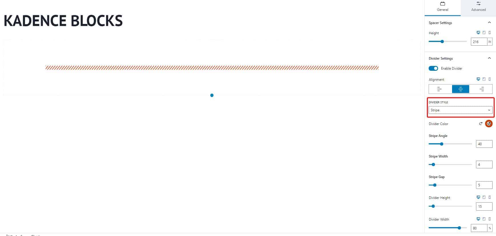
Stripe Divider: You can adjust the solid divider’s color, stripe angle, stripe width, stripe gap, height, and width.
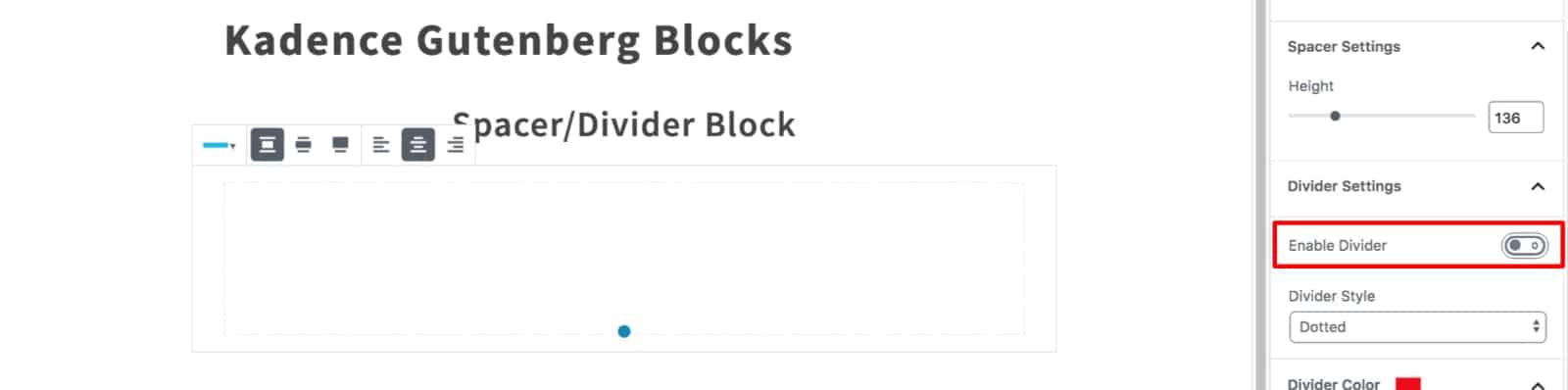
You can also disable the divider if you want to create space alone.
The Spacer/Divider block’s Advanced tab has Visibility Settings to hide the block on desktops, tablets, and mobile devices. You can also save your current block settings as default settings for future Spacer/Divider blocks.