Modal Block
The Kadence Modal Block lets you display content in an overlay window without leaving the page. It’s perfect for adding popups, alerts, forms, or extra details in a clean, focused way. With full control over design, behavior, and content, you can create modals that match your site’s style and enhance user engagement without disrupting the browsing experience. This guide will show you how to add a Modal Block to your page.
See the Modal Block Quick Start Guide for a step-by-step introduction to using this block.
The Modal Block is part of Kadence Blocks Pro, available as a stand-alone purchase or included in our Plus, Ultimate, and Lifetime Ultimate Plans for the best value and flexibility.
Block Settings
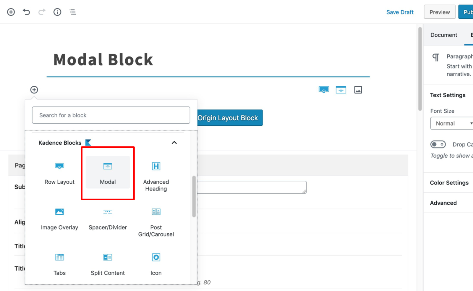
You can add a modal to the page by finding the Modal block.
General
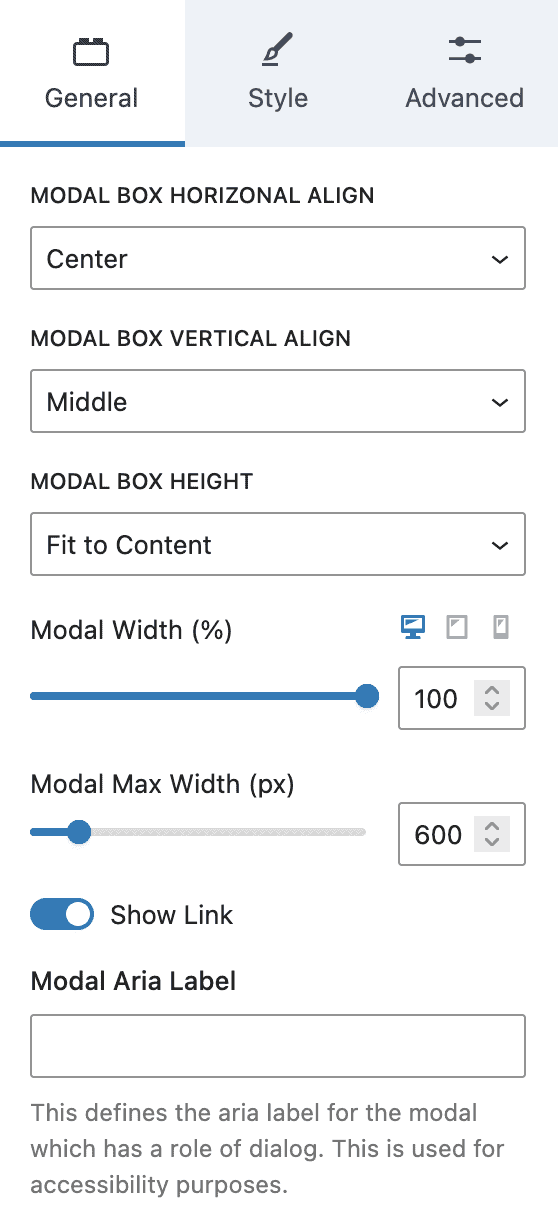
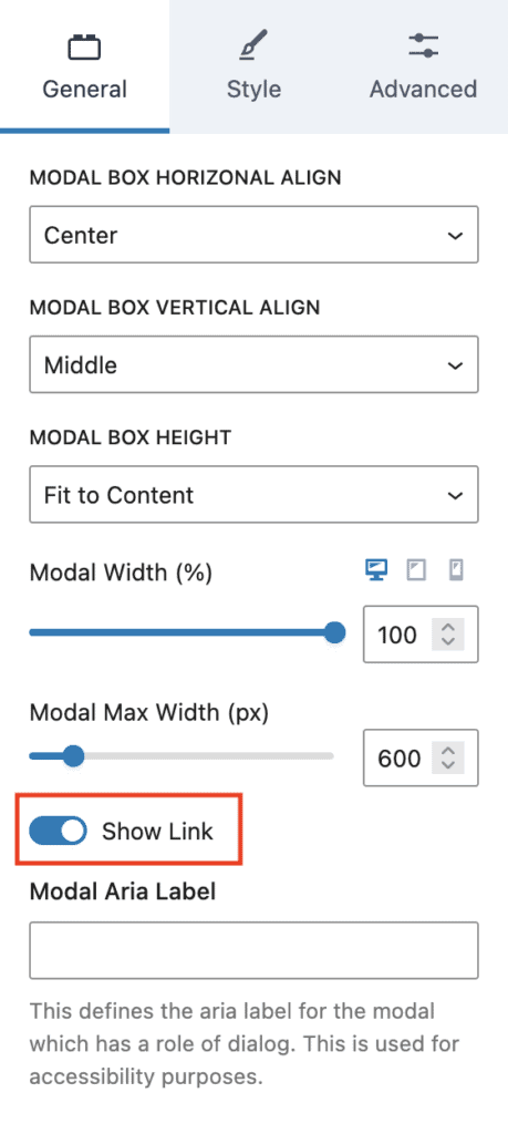
The Modal block provides several settings in the General tab.
Modal Box Horizontal Align lets you align the modal to the center, left, or right.
Modal Box Vertical Align sets the modal to the middle, top, or bottom of the screen.
Modal Box Height can be “Fit to Content”, “Fixed Minimum Height”, or “Full Screen Height”. For “Fixed Minimum Height”, a field is added that allows you to set the minimum height.
Modal Width (%) can be set for desktop, tablet, and mobile devices.
Modal Max Width (px) sets the maximum width of the modal.
Show Link allows you to show or hide the modal open button. This is useful is you are using a custom link elsewhere to open the modal.
Style
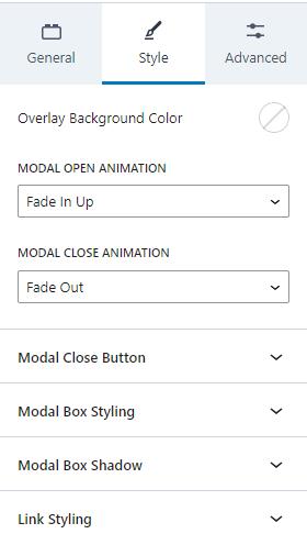
The Style tab has settings for the Modal style. You can adjust the Overlay Background Color, add a Modal Open Animation, and a Modal Close Animation.
Additionally, there are settings for the Modal Close Button, the Modal Box Styling, Modal Box Shadow, and the Link Styling.
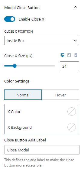
Modal Close Button
When Modals open, they can be closed. You can enable or disable the close button. Either way, the modal closes when the user clicks outside of the modal.
The close button displays an “X” and can be positioned inside or outside of the modal box. You can also adjust the close button size for desktop, tablet, and mobile devices.
There are color settings for the close button. You can adjust the normal colors and the colors for when the user hovers over the button. You can change the “X” color and background.
There is also a setting to change the Close Button Aria Label. This setting defines the aria-label for accessibility.
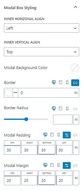
Modal Box Styling
The modal box can be styled. The inner horizontal and vertical alignments can be adjusted. Horizontally, it can be aligned left, center, or right. Vertically, the content can be aligned to the top, middle, or bottom.
The modal can have a background color.
You can set the border color and size. This can be set independently for desktop, tablet, and mobile devices.
The border radius can also be set for desktop, tablet, and mobile devices. You can adjust the setting with a slider or using the number pad.
Modals have padding and margin settings to add space. These values can be adjusted for desktop, tablet, and mobile devices.
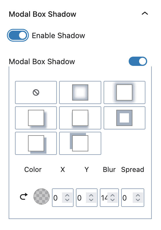
Modal Box Shadow
The modal box can have a box shadow. You can choose from several presets or manually set the color, X and Y offset, blur, and spread.
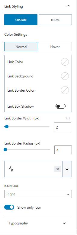
Link Styling
Links can inherit the theme’s link style, or create a custom style.
When setting a custom style, you can set the normal or hover colors. You can set custom link, background, and link border colors. You can also add a shadow for the link box.
The link border width can also be adjusted along with the link border radius.
The links can have an icon in the text. The icon can be on the right or left sides of the text. Additionally, there is an option to show only the icon.
Lastly, there are Typography settings to change the font settings.
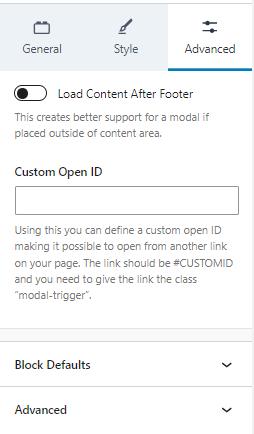
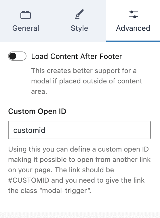
Advanced
The Advanced tab has a few advanced options. Generally, the modal block is used inside the content of a post. However, if the Modal is placed outside of the content, the “Load Content After Footer” setting may help if the modal breaks.
The modal can also have a custom open ID. The Custom Open ID setting lets you define a link ID to open the modal. However, keep in mind that the link needs a “modal-trigger” class too.
Opening a Modal With a Custom Link
First, you need to set a custom open ID for the Modal Block.
Under the Advanced setting tab, locate the “Custom Open ID” field and add an ID for your custom link. In this example, we used customid.
Important! This ID must be unique on the page. Duplicate IDs on the page will cause this modal to fail.
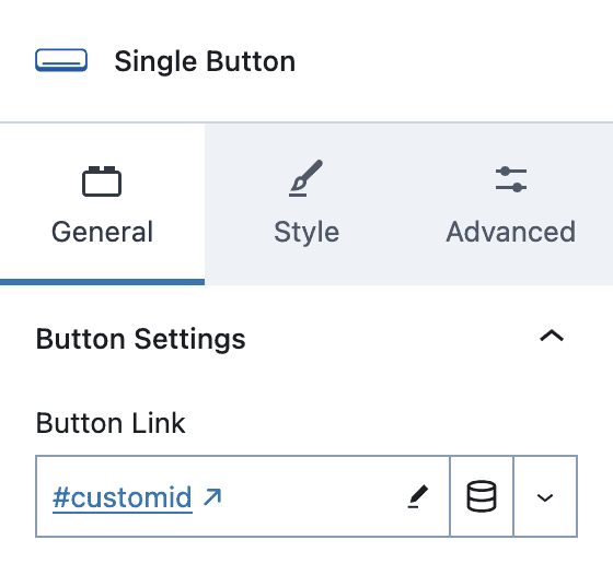
Next, create an Advanced Button that will open this modal.
Set the link to match your Custom Open ID for your Modal Block (i.e. #customid) And don’t forget the #
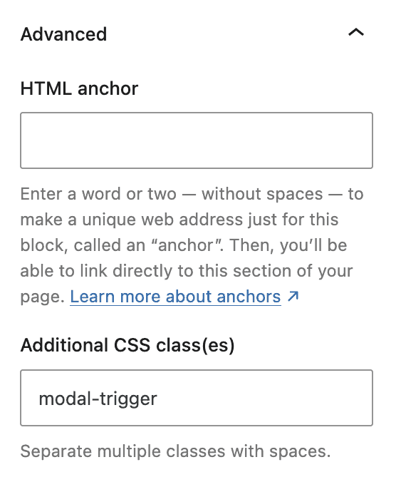
Under the Advance tab, scroll down to the Advanced section.
Add the class modal-trigger to the Additional CSS class(es) field.
NOTE: You can have multiple buttons in various places around your page that open the same modal. Just add another Adv Button block anywhere on the page and use the same settings as above (i.e. button link and CSS class)
If you prefer to only use your custom button(s) to open the modal, you can turn off the button in the Modal Block.
Under the General settings tab, turn off the “Show Link” to remove the modal open button.
Publish your page and your button(s) will now open the modal.