Image Overlay Block
The image overlay block adds a highly customizable image menu option to the new editor. The block provides a background picture with an overlay. The overlay can have a background color and text and offers many customizable settings.
To set up the image overlay on your site, follow the quick start tutorial.
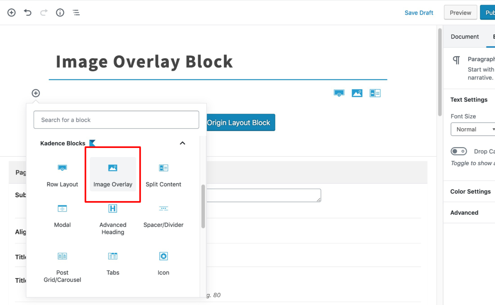
Select the Image Overlay Block from the blocks list:
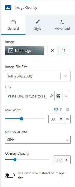
General
The general tab lets you set several customizations. There is an image selector to choose or update the image. The image can be set dynamically.
The image file size provides options for sizes registered on your site. The image overlay also lets you set a link for the image.
The max width setting sets the max width of the image and is adjustable for desktop, tablet, and mobile devices by clicking on the corresponding icons.
There are several animation options provided when a mouse hovers over the image. The image can remain static, zoom in, slide, grayscale, or blur when the hover event triggers.
The overlay opacity settings set the opacity of the overlay color when the image isn’t hovered over.
The image can preserve a ratio size instead of the image size if you enable the option.
Style
The style tab provides several sections of settings.
The style tab sets the image overlay color using a color selector.
The overlay hover opacity sets the opacity for the overlay color when the mouse hovers over the image.
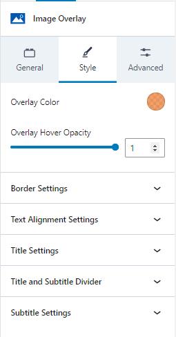
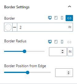
Border Settings
Border settings let you change the border color, style, and width. You can also adjust the border-radius and position from the edge.
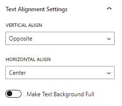
Text Alignment Settings
You can adjust the text’s vertical and horizontal alignment. The vertical value can be the top, center, or opposite. The horizontal alignment can be left, center, right, or opposite. The opposite value sets the title and text to opposite alignments.
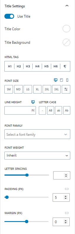
Title Settings
The title settings allow you to enable or disable the title text. You can also change the color, background color, HTML tag, font size, line height, letter case, font family, font weight, letter spacing, padding, and margin.
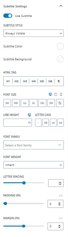
Subtitle Settings
The subtitle settings provide similar settings as the title. The subtitle can be enabled or disabled. In addition to the other settings, the subtitle can be hidden until hovered or always be visible.
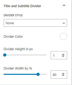
Title and Subtitle Divider
The title and subtitle can have a divider between them. The divider style can be solid, dashed, dotted, or double lines. You can also change the divider’s color, height, and width.
Advanced
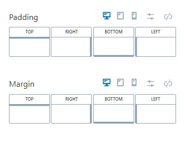
Padding / Margin
You can set the padding and margin in the advanced tab. The values can be set individually or can be linked. The settings can also be adjusted for desktop, tablet, and mobile devices.